Camp Spark | Brand Refresh
Camp Spark is a camping event for middle and high school students that I have the honour of co-leading. In July 2015, we launched the new camp along with the brand. At the time, it was a functional design to help us launch the vision: to be the light in the world. However, the "functional" design was just that and temporary.
To view my original post on the original Camp Spark design process, CLICK HERE.
The original design was very fluid. A sketched/hand drawn design. It was a fun design to get us started and by all accounts, it has been very effective. However, it had a couple of issues. First, because of the hand drawn nature, the stylized lightbulb lacked clean lines. This makes it harder to recognize in smaller sizes and far away. Secondly, the circle surrounding the wordmark and icon make it feel constricted. Overall, I felt the functional design wasn't the best it could be.

Previous design (July 2015)
So, after some time and consideration, I refreshed (more so touched up) the design. The lines in lightbulb are even and the inner circle is gone. The "be the light" tagline font was changed to match the more rounded nature of the icon. This font is called Typo Round. I thought the "Camp Spark" font, Luna, still fit well. Plus, I thought it was important for something other than the color scheme to carry over from the previous design.

Refreshed design (Oct 2016)

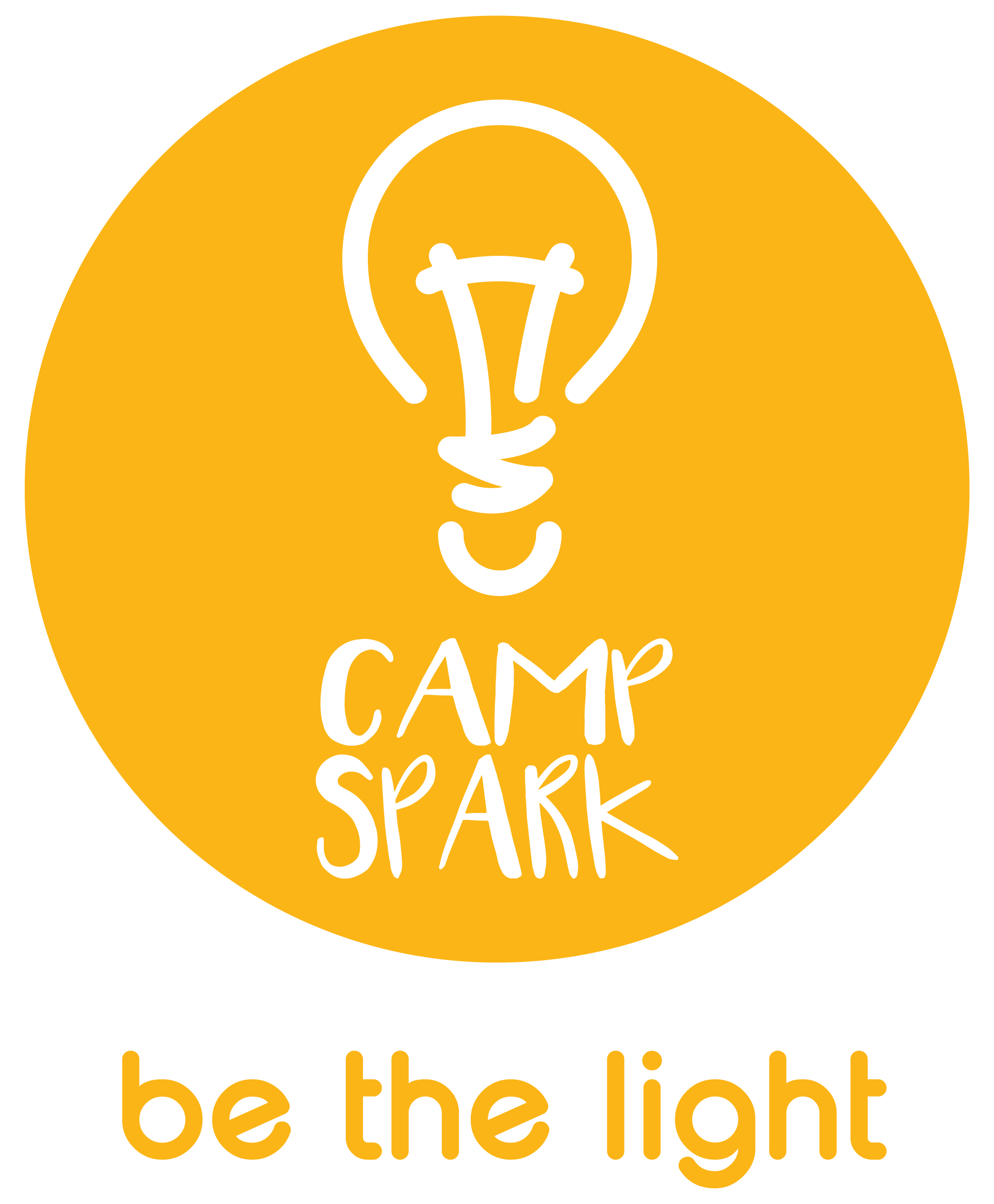
The original design maybe would have lasted another few years before aging. I'm confident that this design, which is much more controlled and fine-tuned, will last longer. The previous design was still very new, but I realized it was time to mature the design to more than just functional. While I do not regret creating the original design, I would not recommend refreshing a visual brand this quickly. Take as much time as possible to refine the imaging.
—kb