Creating Camp Spark
A few posts ago, I mentioned that I co-lead a camp during the winter and summer. As of June 2015, the camp event transitioned it's name to Camp Spark. The name and tagline "Be The Light" come from a Bible passage:
“You are the light of the world. A city built on a hill cannot be hid. No one after lighting a lamp puts it under the bushel basket, but on the lampstand, and it gives light to all in the house. In the same way, let your light shine before others, so that they may see your good works and give glory to your Father in heaven.”
I was really excited about creating and helping to launch this new brand. In this post, I want to share the behind the scenes process to the final product and then show some implementations. Let's start with some initial sketches. I used the iPad app Paper by FiftyThree (highly recommended). The stylus is Pencil by FiftyThree. I definitely wanted to incorporate something that resembled a light source or shiny object—a spark, the Sun, lightbulbs, etc.
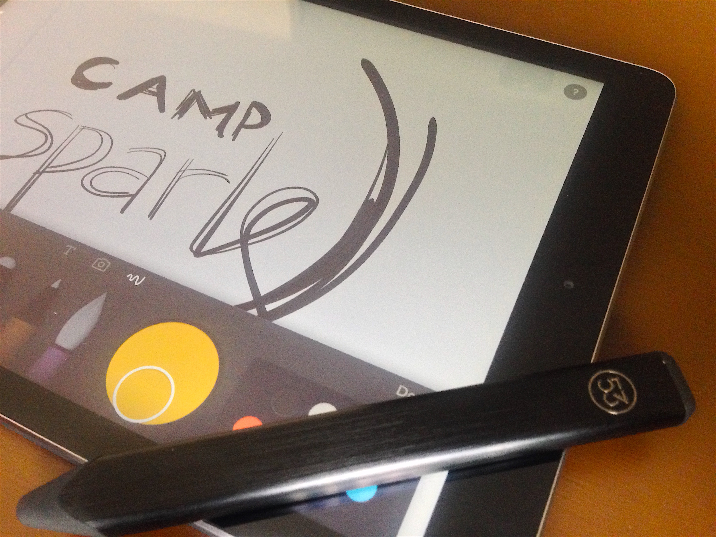
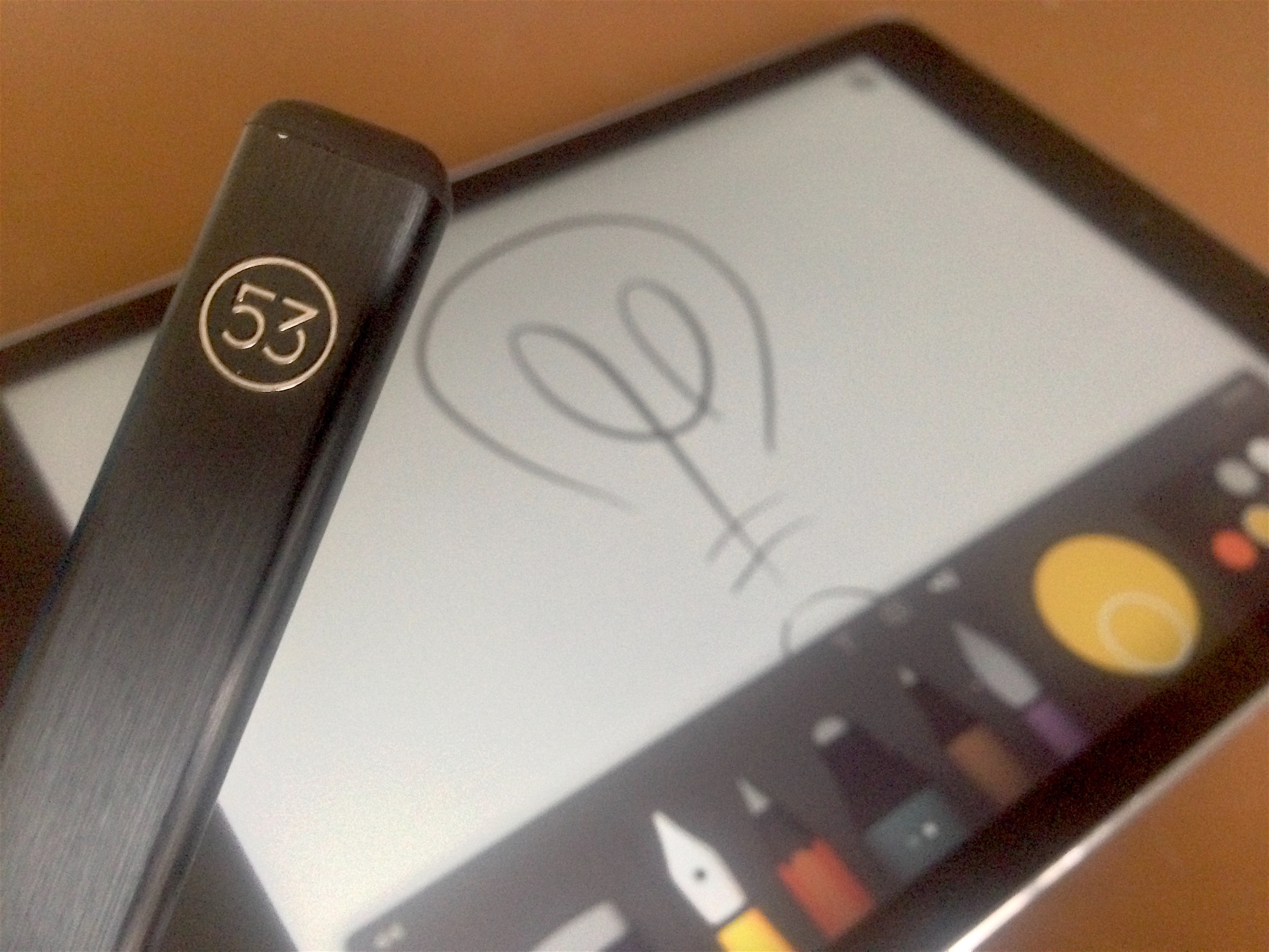
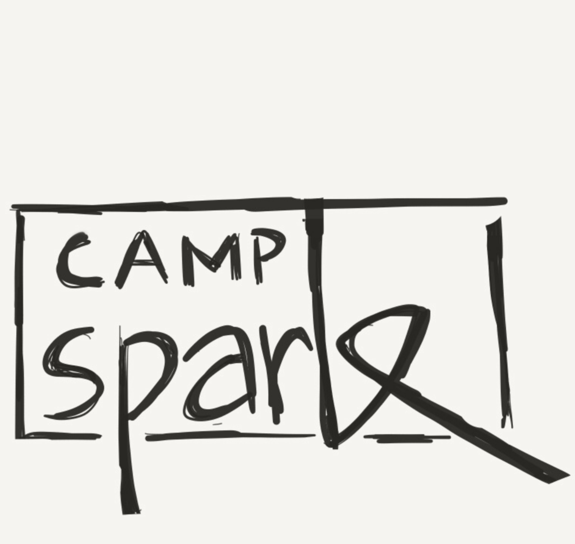
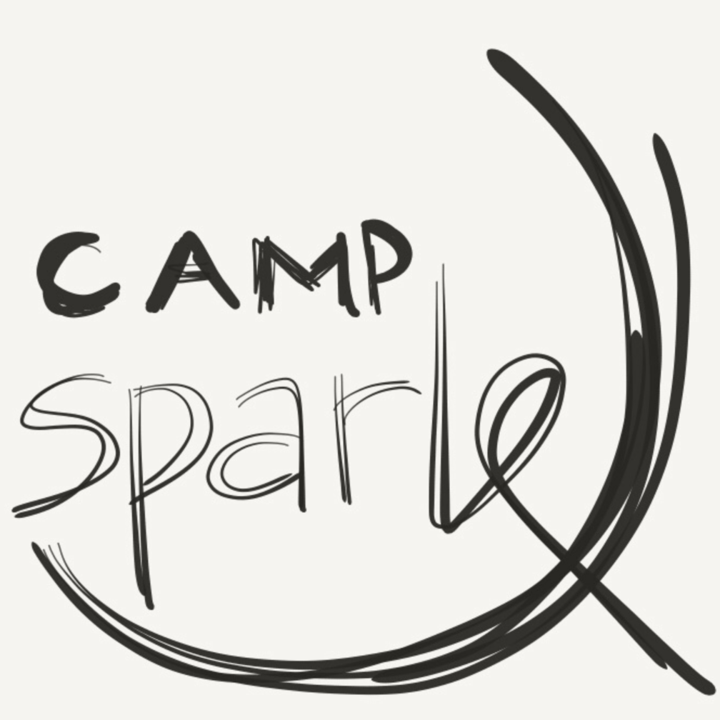
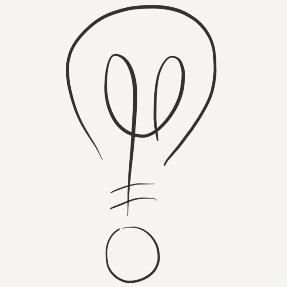
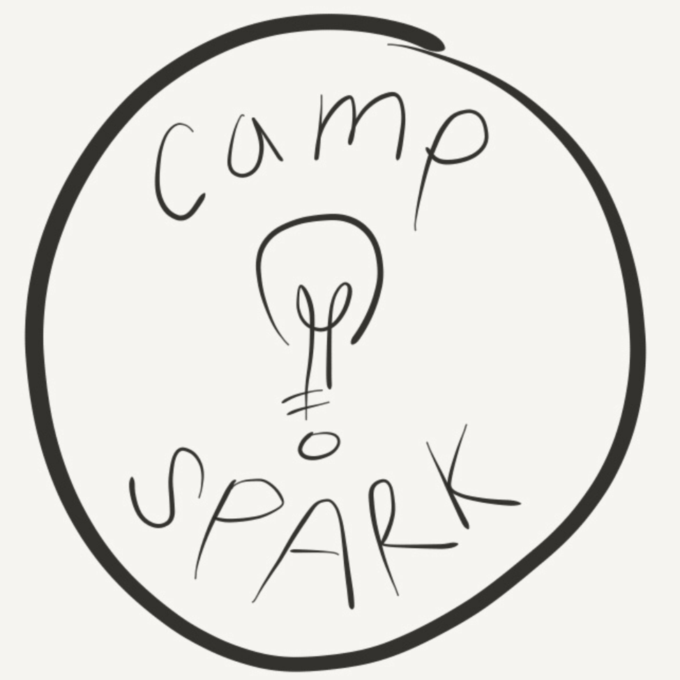
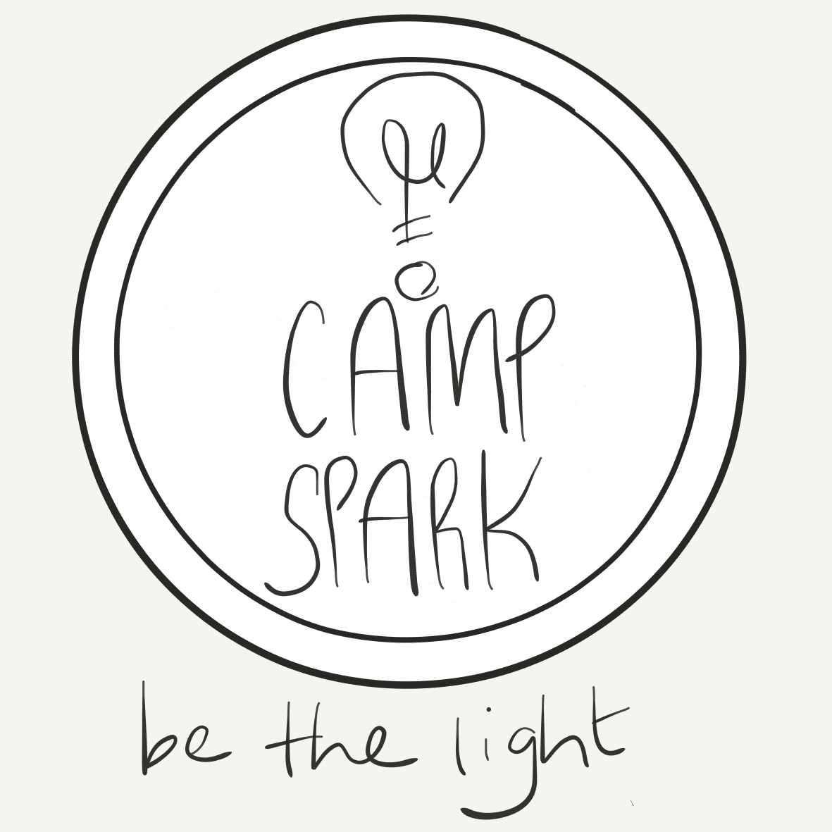
The idea evolved from a stylized word-mark to a light bulb and icon/emblem concept. After deciding on the direction I thought was best, I exported and vectorized the Paper drawings. This led to the creation of the final concept:


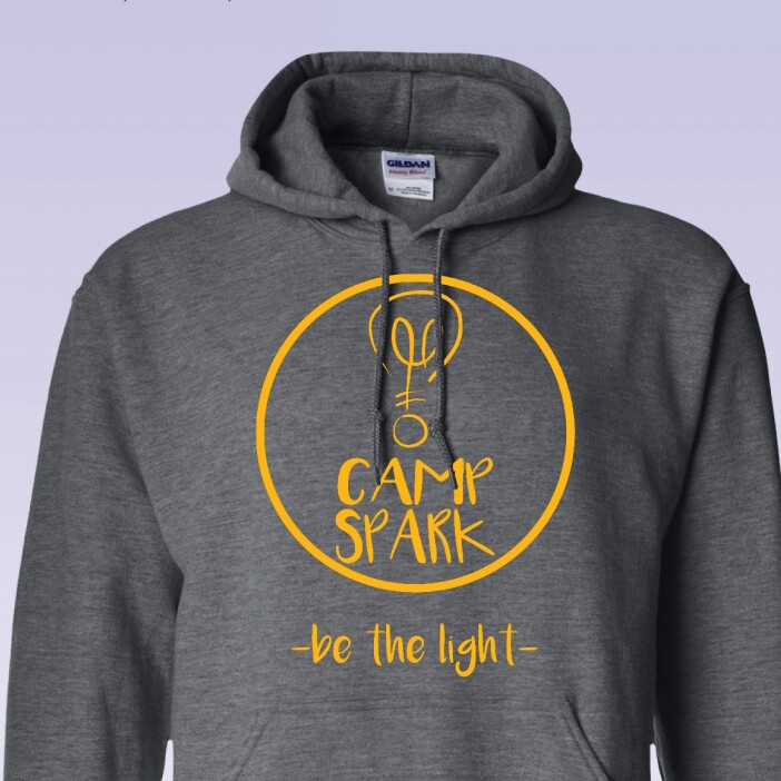
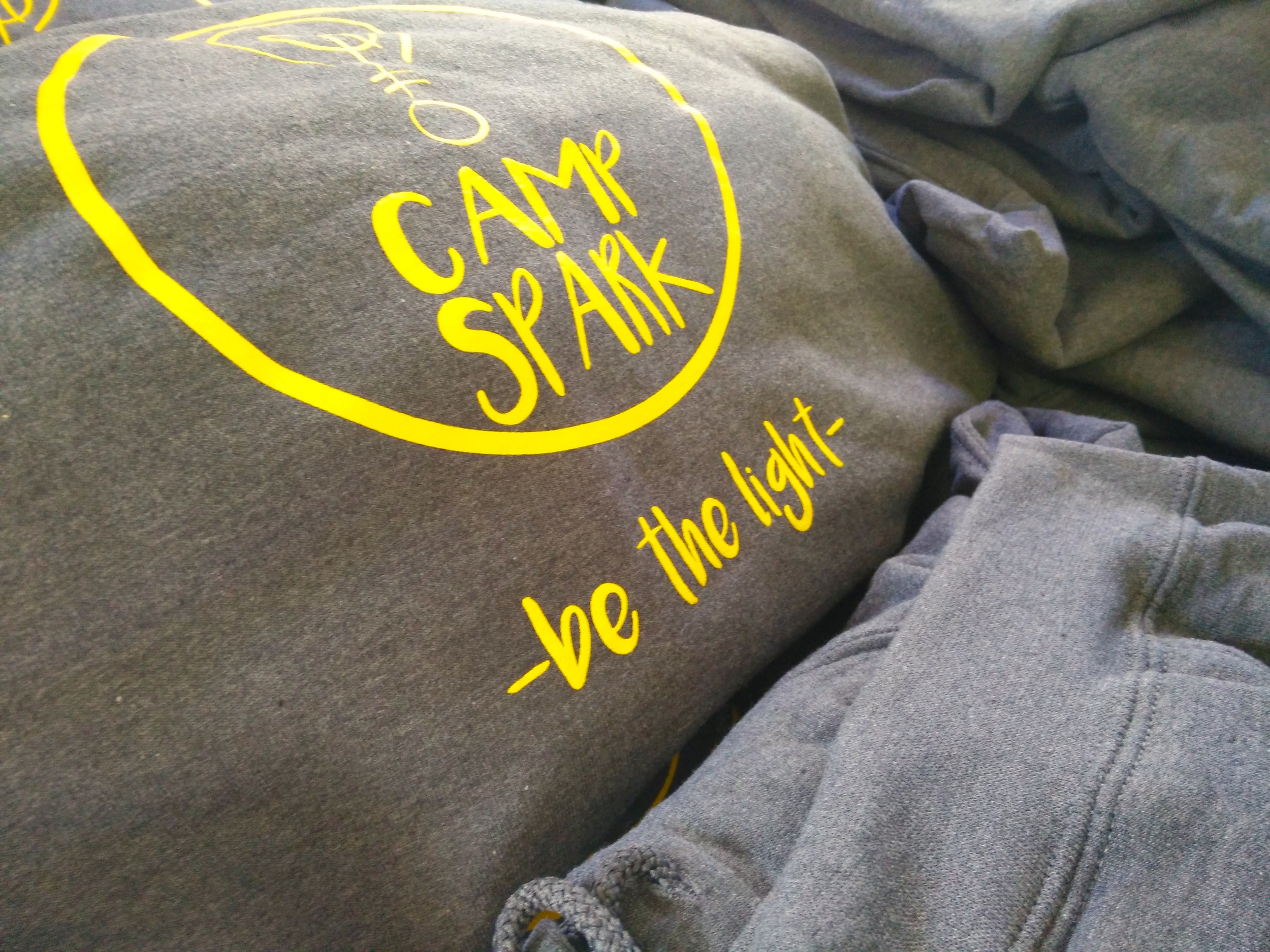
I went through a number of yellows. This tone of yellow seemed to be bright and warm—welcoming even. With the typeface, I didn't want it to be taken too seriously. Camp Spark is a youth camp and the imaging should reflect the fun times that kids have. The font "Luna" is a great handwriting script type.
Now, for some implementations.
Hoodies:
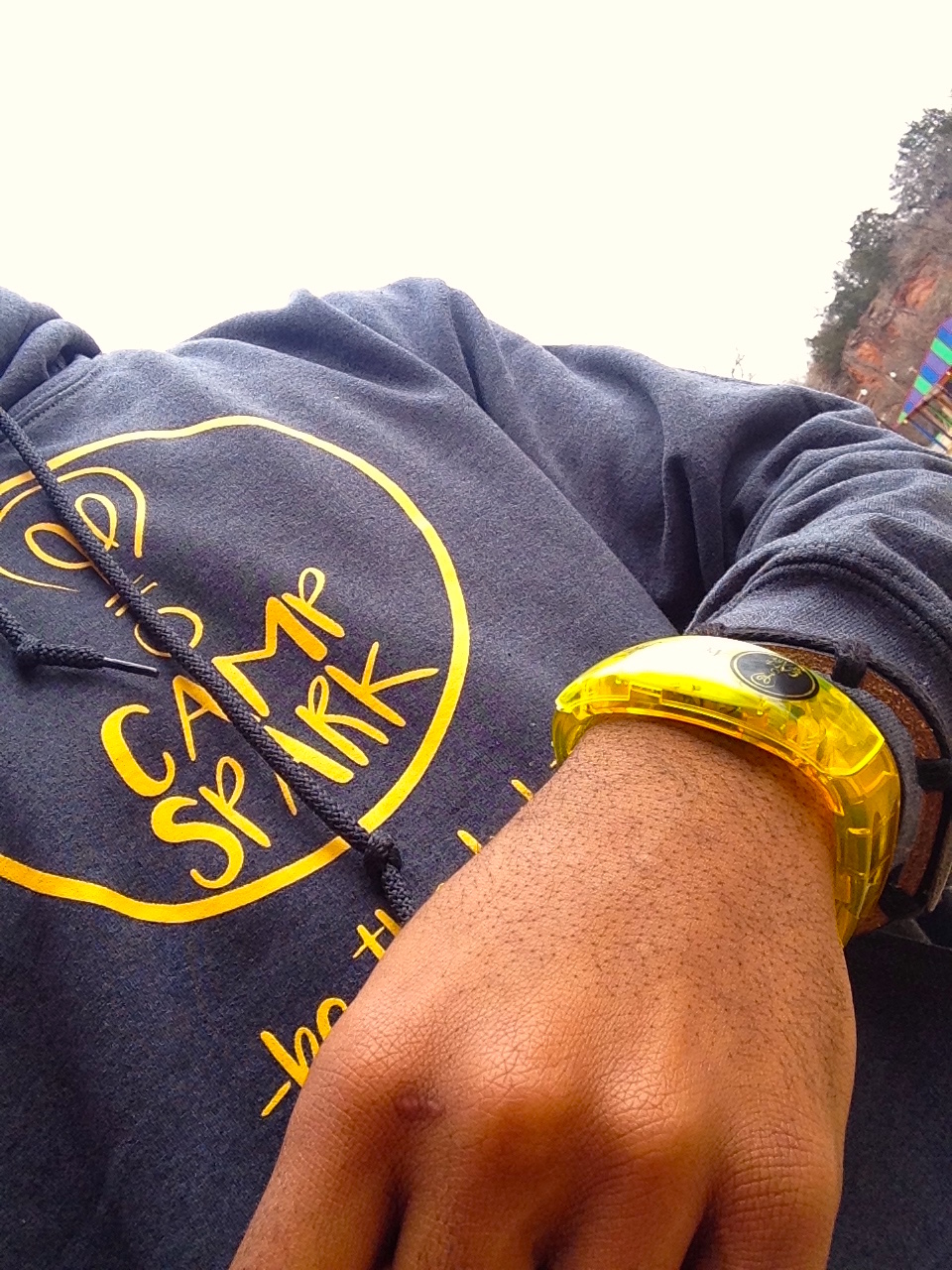
LED Bracelets. We used these on the closing day's worship service.
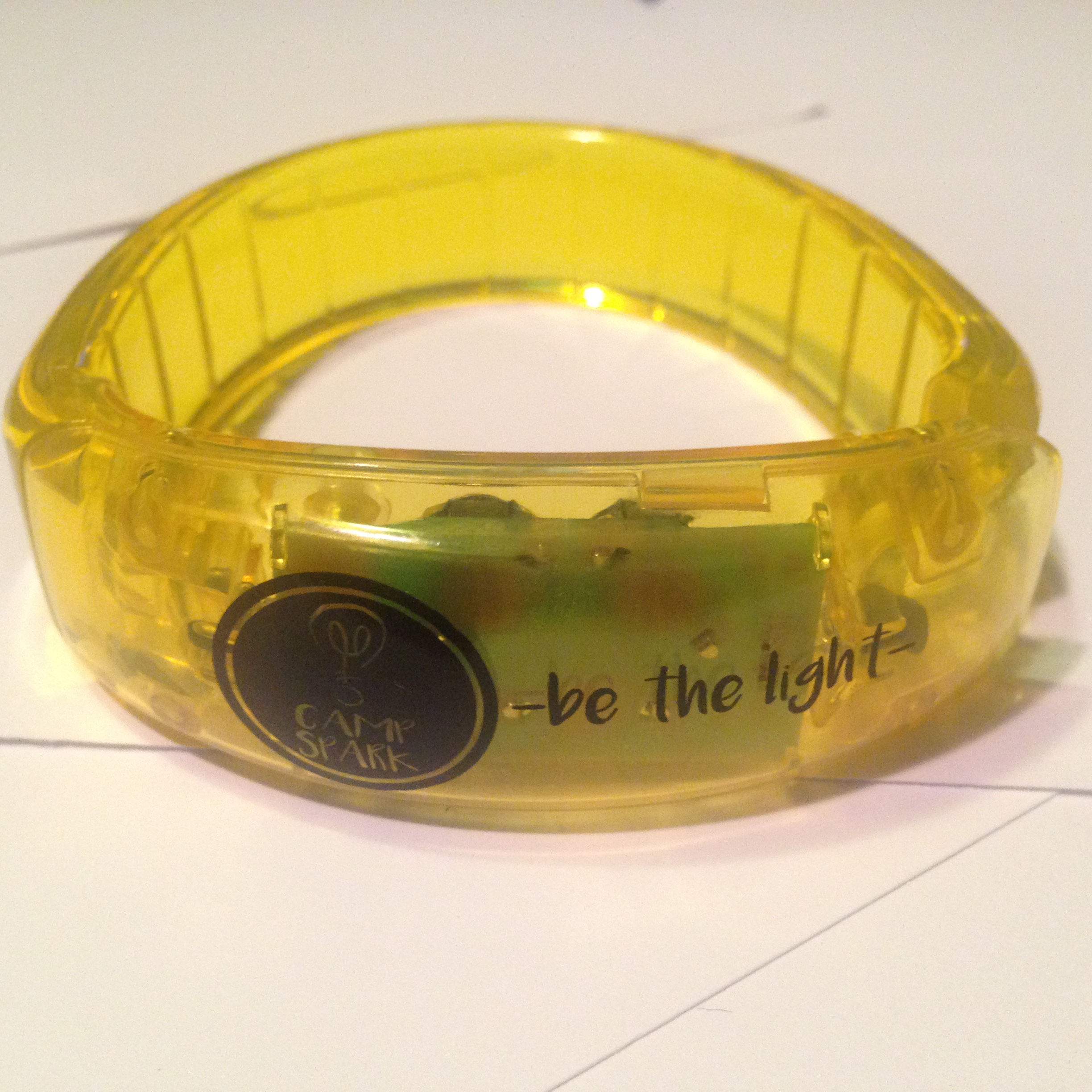
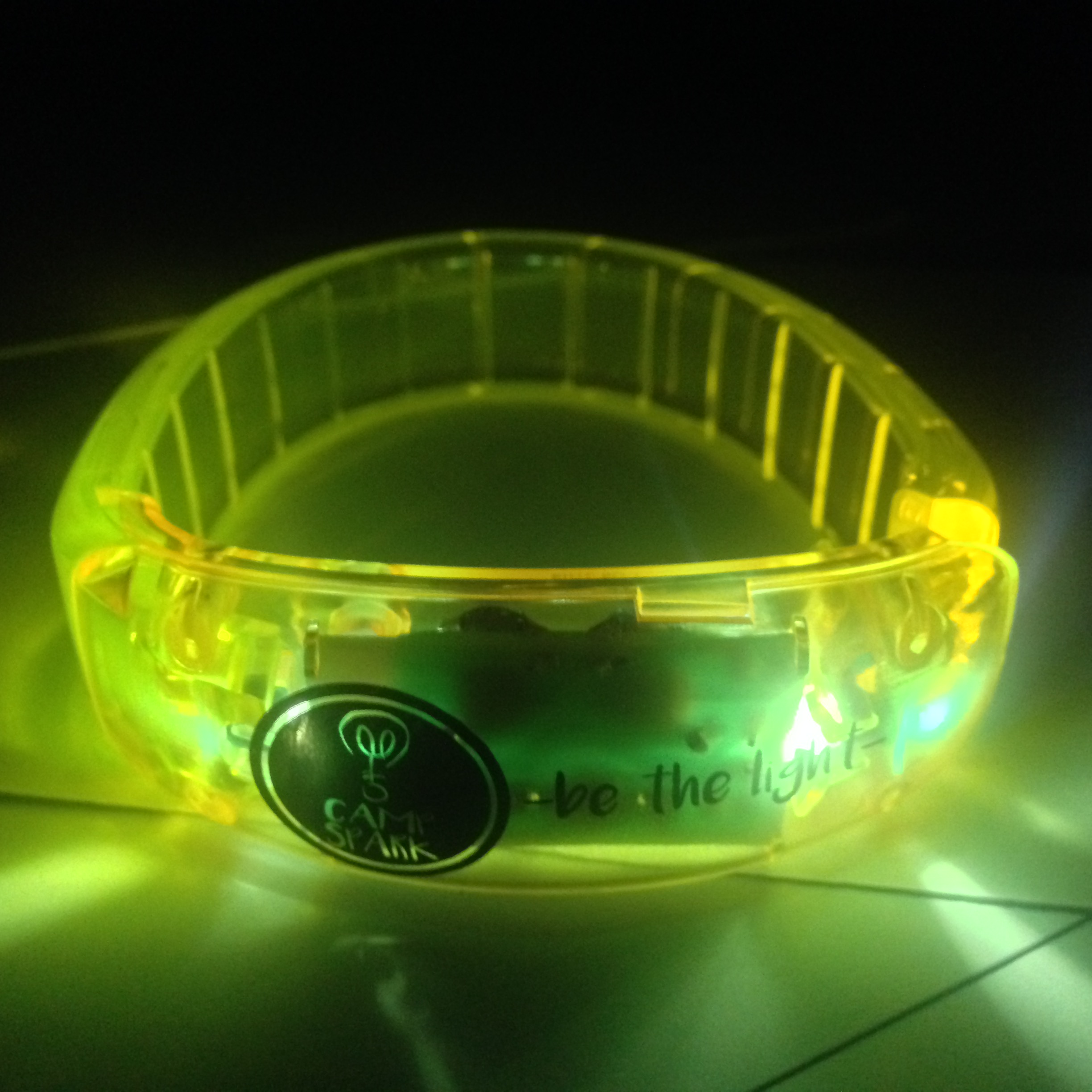
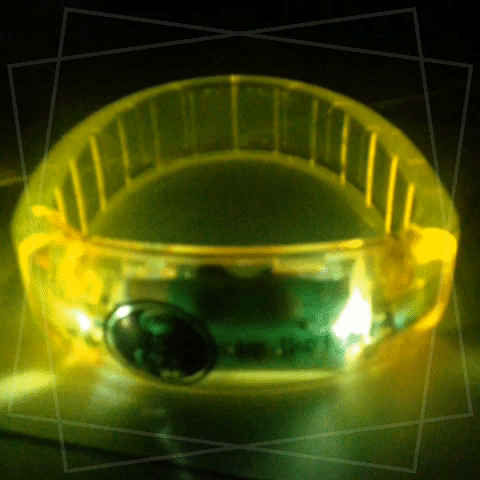

Image used for projection.
Background image: Josh Byers via Unsplash

Thank you cards
I'm excited about where the brand is going.
I'm even more excited about the message it carries.
